Responsive web design

« Back to Glossary Index

What is Responsive Web Design

What is responsive web design?

Responsive web design is an approach where a designer creates a website that adapts or changes itself depending on the type of device it is being viewed through. This can be an oversized desktop computer monitor, a laptop or devices with small screens like smartphones and tablets. Today responsive web design has become an indispensable tool for anyone with a digital presence. With the growing use of smartphones, tablets, and other mobile devices, more and more people are using smaller screens to view web pages.

These websites must also comply with Google's just-implemented 2018 mobile-firstIndex take into account. As more and more small businesses increase their mobile presence, their website, E-commerce, Google Business Page, Social Media Pages, and other assets be easily accessible across all devices.
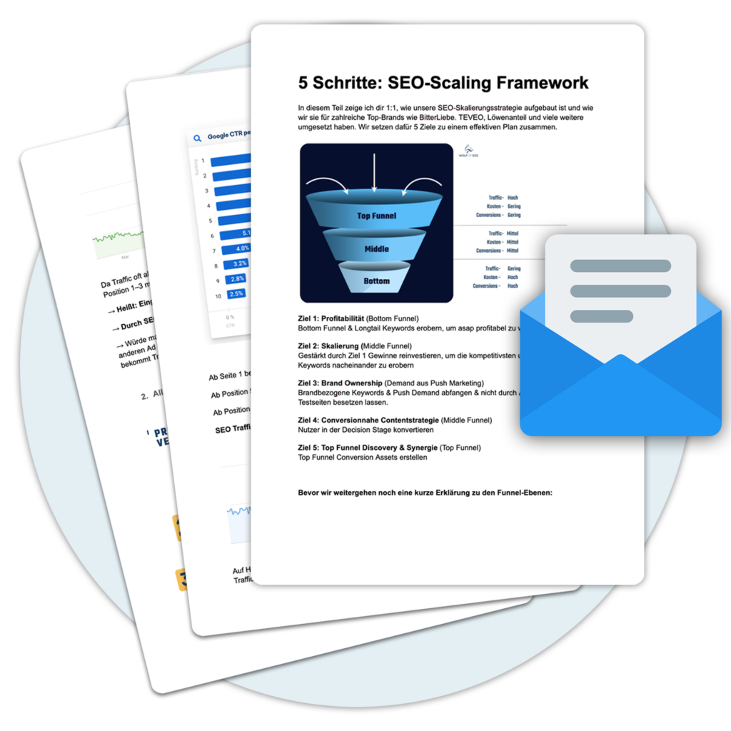
 

An example of "Responsive Design

Let's take a traditional "fixed" website. For example, if the website is displayed on a desktop computer, it may contain three columns. However, if you display the same layout on a smaller tablet, it may require you to scroll horizontally, which users don't like. Or elements may be hidden from view or look distorted. The impact is also complicated by the fact that many tablets can be viewed in either portrait or landscape mode.

Websites can be even harder to see on a tiny smartphone screen. Large images can "break" the layout. Websites can load slowly on smartphones if they are graphics-intensive.

However, if a website uses responsive design, the tablet version may automatically adjust to display only two columns. This way, the content is readable and easy to navigate. On a smartphone, the content may appear as a single column, perhaps stacked vertically. The user may also have the ability to drag across to view other columns. Images are resized rather than distorting the layout or being cut off.

The point is: with responsive design, the website automatically adapts to the device in which the viewer sees it.

How does Responsive Web Design work?

An rektiAll page elements are sorted by proportions, not pixels. So if you have three columns, you wouldn't say exactly how wide each one should be, but how wide it should be in proportion to the other columns. Column 1 should take up half the page, column 2 should take up 30%, and column 3 should take up 20%, for example. Media such as images will also be relatively enlarged. A

In this way, an image can remain within its column or relative design element.

« Back to Glossary Index

FAQ

What is responsive web design? arrow icon in accordion
Responsive web design is a concept that allows web designers to create websites that automatically adapt to the user's screen size. It uses the latest technologies and techniques to ensure that websites work flawlessly on all types of devices, including laptops, tablets, and smartphones.
What technologies are used for responsive web design? arrow icon in accordion
Responsive web design uses various technologies, including HTML, CSS, JavaScript, and media queries. It also uses various frameworks like Bootstrap, Foundation, and others to simplify the development of responsive websites.
Why is responsive web design important? arrow icon in accordion
Responsive web design is important because it allows websites to display correctly on different devices. This is especially important as more and more people view their websites on mobile devices and tablets.
What are media queries? arrow icon in accordion
Media queries are a CSS feature that allows developers to determine how a website is displayed on different devices. Media queries allow developers to specify how certain elements are displayed on different screen sizes, providing an optimal user experience.
What is a grid system? arrow icon in accordion
A grid system is a layout system that allows developers to easily structure and customize websites. It works by adding a grid to a website design that allows the developer to position elements on a page.
How can developers ensure that their website is responsive? arrow icon in accordion
To ensure that a website is responsive, developers need to make sure that they use the latest technologies and techniques such as media queries and grid systems. They also need to make sure that they follow the latest trends and developments in web design to ensure that the website works correctly on all devices.
What are the advantages of responsive websites? arrow icon in accordion
Responsive websites have many advantages. They allow businesses to adapt to different screen sizes and optimize their websites on all devices. They can also improve search engine optimization and increase traffic.
How long does it take to create a responsive website? arrow icon in accordion
The time needed to develop a responsive website depends on various factors, such as the complexity of the design and the type of technologies used. In general, however, it can be said that it can take anywhere from a few weeks to several months to develop a responsive website.
What should a developer consider when creating a responsive website? arrow icon in accordion
When creating a responsive website, developers should pay attention to a few things. First of all, they should make sure that they use the latest technologies and techniques to ensure that the design works properly on all devices. They should also familiarize themselves with the latest trends and developments in web design to ensure that their website is up to date.
Is it possible to create a website without responsive web design? arrow icon in accordion
Yes, you can create a website without responsive web design. However, it will not display correctly on different screen sizes and you may encounter navigation and user experience issues. Therefore, we recommend using responsive techniques when developing a website to provide an optimal user experience for all devices.

With top positions to the new sales channel.

Let Google work for you, because visitors become customers.

About the author

Social Media & Links:

Your free gift!
Our SEO strategy
Webinar

You want more visitors and better Google rankings?

Watch our free SEO strategy webinar now and understand where your SEO levers are and how to tackle them head on.